
This page is for the ‘full’ Calendar, similar to the admin events calendar. If you’re looking for details on the ‘widget’ calendar, see this page.
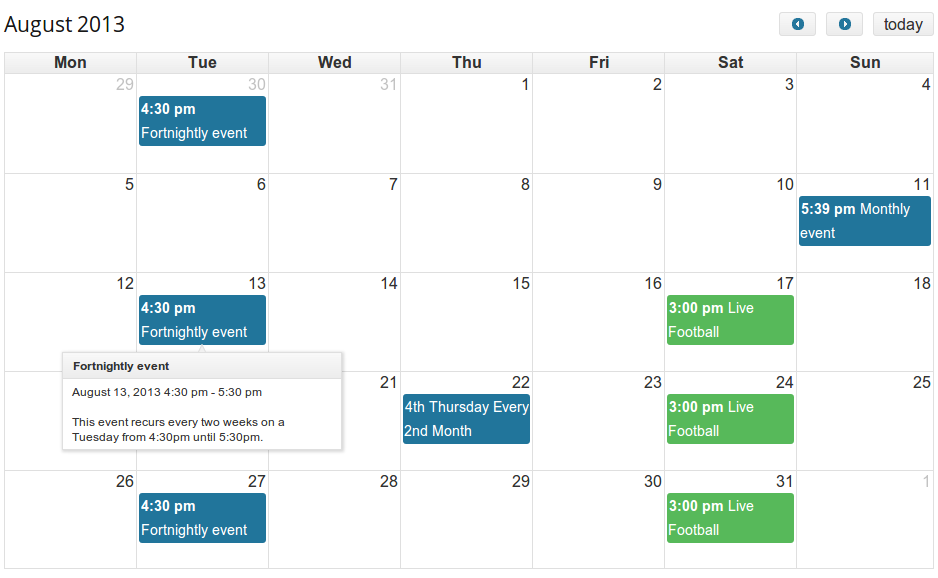
The ‘fullCalendar’ shortcode displays an events calendar, similar to the ‘admin calendar’, and gives you a large degree of flexibility. Apart from the extensive options available (listed below), you can also customises the content of the event tooltips.
Displaying Your Events Calendar
[eo_fullcalendar att1="val1" att2="val2"]
The optional attributes (‘att1’, ‘att2’) allow you to customise the events calendar, for instance to add buttons or filters, customiser the date/time format or the ‘view’ of the calendar. See the section below for the supported attributes and their values.
Available Options
Below is a list of the options (called ‘attributes’) available to you when displaying your calendar. All are optional and you can display a calendar without specifying any of these attributes.
Default View
-
defaultView This selects the default view of the calendar when it is loaded. You can add buttons to allow the user to change the view in the ‘header’ attributes below. (Default:
'month'). One of'month','agendaWeek','agendaDay','basicWeek','basicDay''listDay''listWeek''listMonth'
-
year – Specify the year (2014,2015 etc) the calendar should open on. By default, it is today’s year.
-
month – Specify the month by number (1 for January,…, 12 for December), the calendar should open on. By default, it is today’s month.
-
date – Specify the date (1-31) the calendar should open on. By default, it is today’s date.
Calendar Header
- headerLeft, headerCenter, headerRight These attributes determine what appears at the top of the calendar, on the left, centre and right, respectively: including, navigation buttons, buttons to switch the calendar view, or drop-down filters. Any collection of
'title'– displays the current month/week/day- the views (
'month','agendaWeek','agendaDay','basicWeek','basicDay') – buttons to toggle bewtween the views, 'category'– adds a dropdown to filter by category'venue'– adds a dropdown to filter by venue'country'– adds a dropdown to filter by country (Pro only)'state'– adds a dropdown to filter by state (Pro only)'city'– adds a dropdown to filter by city (Pro only)'next'and'prev'– buttons to navigate the calendar'today'– button to jump to today’s date. In month/week view this will jump to the appropriate month/week.'goto'– button to open a datepicker to jump to a particular date. In month/week view this will jump to the appropriate month/week.
Separate these by either commas or spaces (to place a gap in between the buttons). Use ” to leave that part of the header empty.
Defaults: headerLeft: 'title', headerCenter: '', headerRight: 'prev,next today'
Calendar Filters
These attributes allow you to restrict events on the calendar to specified categories, venues or events booked by the current user.
- category – A comma delimetered list of category slugs to show on the calendar. Leave blank for all.
- venue – A comma delimetered list of venue slugs to show on the calendar. Leave blank for all.
- users_events – (‘true’ or ‘false’). If true display only events for which the current user is attending
Calendar Appearance
These attributes allow you to alter the appearance of the calendar:
- theme: – Whether to use the jQuery UI theme. Setting this to false makes styling the calendar easier. Defaults to true.
- tooltip: – Whether to display a tooltip. True/false. Defaults to true. Content is filtered by
eventorganiser_event_tooltip - weekends (default:
true) – whether to include weekends in the calendar - mintime (default: “) – Determines the first hour/time that will be displayed, even when the scrollbars have been scrolled all the way up.
- maxtime (default:
24) – Determines the last hour/time that will be displayed, even when the scrollbars have been scrolled all the way down. - alldayslot (default:
true) – Determines if the “all-day” slot is displayed at the top of the calendar - alldaytext (default:
__('All Day','eventorganiser')) – Sets the text for the all day alot
Date & Time Format
Tip: The format argument supports a few special operators. They include
-
{...}switches to formatting the 2nd date. -
((...))only displays the enclosed format if the current date is different from the alternate date in the same regards.
For example the default value of titleformatweek is M j(( Y)){ '—'(( M)) j Y} and produces the following dates: Dec 30 2013 — Jan 5 2014, Jan 6 — 12 2014
These attributes allow you to change the date and title formating of the calendar:
- timeformat: The format in which the time appears on the events. Specify in php format. Default:
H:i - axisformat (default:
ga) – time format displayed on the vertical axis of the agenda views - titleformatday (string) Date format (PHP) for title for month view. Default
l, M j, Y - titleformatweek (string) Date format (PHP) for title for week view. Default
M j(( Y)){ '—'(( M)) j Y}. - titleformatmonth (string) Date format (PHP) for title for day view. Default
F Y - columnformatmonth (default:
D) – Determines format of the date in the column headers in month view - columnformatweek (default:
D n/j) – Determines format of the date in the column headers in month view - columnformatday (default:
l n/j) – Determines format of the date in the column headers in day view
Examples
To display a calendar with the following options:
- Title in the centre
- Previous/Next navigation buttons, and a ‘today’ button next to them, but with a gap between
- Buttons to switch the Calendar view between month and agendaWeek
use the shortcode as follows:
[eo_fullcalendar headerLeft='prev,next today' headerCenter='title' headerRight='month,agendaWeek']